When building a video chat, Twilio Video provides you with the SDKs and APIs to build video apps that connect your users. However, it is un-opinionated about your interface. With a bit of CSS, we can create effects to make your video chat stand out.
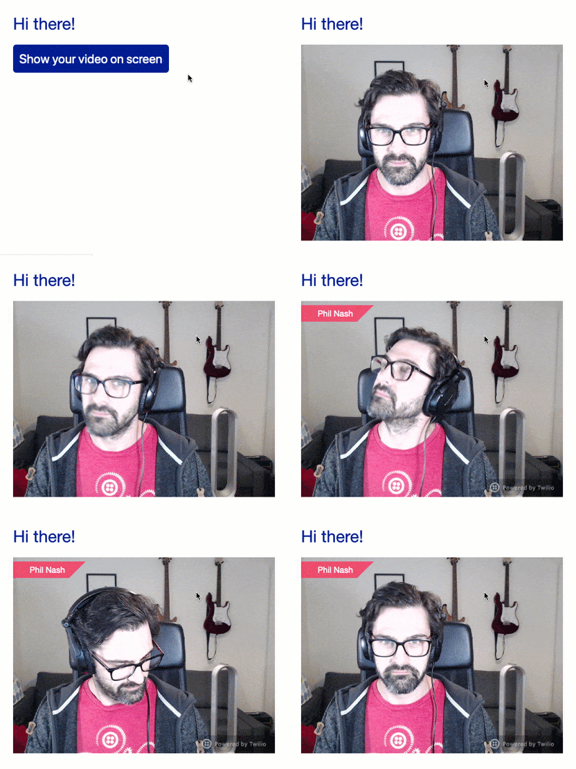
In this post we'll see how to overlay items like a logo or a user's name over a video. Over the course of the post, we'll turn a plain video into something that looks like this:
Getting started
To create these effects we won't build an entire video chat. Instead, we'll take the Twilio Video library and use it to get the camera and put it on the page as if it was a video chat – then style that video.
Create three new files in the same directory to write this application in: index.html, script.js and style.css. Open index.html and fill in this HTML:
<!DOCTYPE html>
<html lang="en">
  <head>
    <title>Hello!</title>
    <meta charset="utf-8" />
    <meta http-equiv="X-UA-Compatible" content="IE=edge" />
    <meta name="viewport" content="width=device-width, initial-scale=1" />

    <link rel="stylesheet" href="./style.css" />

    <script src="https://media.twiliocdn.com/sdk/js/video/releases/2.3.0/twilio-video.min.js"></script>
    <script src="./script.js" defer></script>
  </head>
  <body>
    <h1>Hi there!</h1>

    <p>
      <button id="get-video">
        Show your video on screen
      </button>
    </p>

    <div class="videos">
      <div id="video-container"></div>
    </div>
  </body>
</html>
This HTML loads our CSS and JS files as well as the Twilio Video JS SDK from our CDN (version 2.3.0, the latest as I write this). It also has a button to ask permission to use your camera, and a placeholder <div> with the ID "video-container" that we will add the video to.
Open style.css and enter this base CSS that sets some fonts, margins and colours:
body {
  font-family: "Helvetica Neue", Helvetica, Arial, sans-serif;
  margin: 2em;
}

h1 {
  font-weight: normal;
  color: #001489;
}

button {
  border: none;
  background: #001489;
  color: #fff;
  font-size: 24px;
  padding: 0.5em;
  border-radius: 6px;
}
Open script.js and enter this starter JavaScript. It hooks up the button to ask for permission to show the user's camera and then places it in a video element on the page
const container = document.getElementById('video-container');
const button = document.getElementById('get-video');

button.addEventListener('click', () => {
  Twilio.Video.createLocalVideoTrack().then(track => {
    container.append(track.attach());
    button.remove();
  });
});
Open up index.html in a browser and click the button that says "Show your video on screen". Your browser will ask you for permission to use your camera, and once you confirm you will see yourself on the page.

With that in place we're ready to start adding some overlays.
How to overlay web content
To overlay items on top of a video (or indeed, any web content) we need to consider the CSS. In this application, the video element is laid out subject to the rules of normal document flow. As you might expect, if we add content before the video it will be displayed before the video and if we add it after it will be displayed after.
To overlay content on top of the video we need to take that content out of the document flow and position it over the video.
To do this we'll use absolute positioning. Let's start by adding some content onto the page to position. In script.js add the following code that appends a name after the video is added to the page:
const container = document.getElementById('video-container');
const button = document.getElementById('get-video');

button.addEventListener('click', () => {
  Twilio.Video.createLocalVideoTrack().then(track => {
    container.append(track.attach());
    const name = document.createElement("p");
    name.classList.add("name");
    name.append(document.createTextNode("Your name"));
    container.append(name);
    button.remove();
  });
});
This code uses DOM functions to create a paragraph element with the class "name" and append it to the same container that the video is added to. Reload the browser, you will see the name appear under the video.

Let's place that name at the top left of the video. Open style.css and add the following CSS to the bottom of the file:
.name {
  position: absolute;
  top: 8px;
  left: 0;
}
This takes the .name paragraph out of the document flow and positions it 8 pixels from the top and 0 pixels from the left of its containing element. If you refresh the browser you'll see we haven't quite got this right just yet. The paragraph's containing element is currently the document, so it is being placed relative to the whole page.

To create a containing element we need to define the position of one of the paragraph's parent elements. The element with the id "video-container" will work for this. Add the following to the CSS:
#video-container {
  position: relative;
}
Reload the browser again, and you will see the text is now over the video. We can't read it very well though, so let's add a few more properties to tidy up the appearance.
.name {
  position: absolute;
  top: 8px;
  left: 0;
  margin: 0;
  padding: 0.5em 0.5em 0.5em 2em;
  background: rgba(242, 47, 70, 0.8);
  color: #fff;
  font-size: 16px;
  line-height: 1;
}
This sets the margin to 0 and adds padding to push the text in from the left a bit. It also makes the background red and slightly transparent, makes the text white, and sets the font size and line height to 16 pixels. That looks better.

You can play around with these values or add other ones to get the right feel for your own application.
Getting fancy with CSS triangles
You might have noticed in the original image that one of the edges of the name overlay had an angle to it. Most of CSS is manipulating rectangles, but we can make this effect with pure CSS too.
To do so we generate an element by adding the content property to the pseudo-element ::after which acts as the last child of the selected element. We can then style the pseudo element independently.
To make a triangle, we set the height and width of this element to 0. We then set the top and left borders to be the height, width, and colour we want for the triangle. Finally we set the right and bottom border colours to transparent.
To place the triangle on the far right edge of the paragraph we set the position of the element to absolute. Its containing element is the name paragraph which is positioned absolutely too, so we can define the position relative to that paragraph. To have it stick out the right hand side we place it 0 pixels from the top and -2em from the right. 2em is the width of the element (it is the width of two borders, which are 1em wide each) and we use a negative value to move it to the right of the right edge.
.name::after {
  content: "";
  height: 0;
  width: 0;
  position: absolute;
  top: 0;
  right: -2em;
  border: 1em solid rgba(242, 47, 70, 0.8);
  border-right-color: transparent;
  border-bottom-color: transparent;
}

If you want to learn more, check out this CSS Tricks article to see more about creating CSS Triangles.
Overlaying images
To overlay an image or watermark on the video, we don't even need to add any HTML. Using the generated content trick we saw above with the angled overlay, we can add an image to the video as a sort of watermark.
Next we'll add this image to the bottom right of the video to show that it is powered by Twilio.

Download the image above and save it to your working directory. To make this image appear, we need to insert content into another pseudo-element. This time we'll use ::before on the #video-container element.
We're using the ::before pseudo-element of a <div> because it is not supported on the <video> element.
We'll enter an empty string as the generated content, position the object absolutely 8 pixels from the bottom and right of the element, and give it a size of 140x32 pixels. We'll set the background to the image we downloaded and the background-size to "cover" so that the image fills the element.
#video-container::before {
  content: "";
  position: absolute;
  bottom: 8px;
  right: 8px;
  width: 140px;
  height: 32px;
  background: url(./powered-by-twilio.png);
  background-size: cover;
}
Reload the page. First thing you will notice is that the image appears before we have loaded the video. (We'll fix that in a minute.)
The other issue is that the image doesn't sit in the bottom right hand corner of the video, but instead of the containing element. It is placed absolutely within the <div>, but it is behaving as a typical block level element, filling 100% of the width of the page.

To fix this we need to apply some style that will restrict the width of the #video-container element. We could use a static width, and fit the video element inside, but that won't work so well in a responsive design. Instead, we want the containing element to shrink to the intrinsic size of the video element.
To do this we could float the #video-container element, but this could cause further layout issues. Instead, we'll define the .videos element as display: flex. This causes its child, the #video-container element, to shrink to contain its content. Add the following:
.videos {
  display: flex;
}
I mentioned that setting the container element to a static size wouldn't work well in a responsive design, but this layout doesn't work well either. If the video is wider than the screen then the video gets cut off.
We can fix this in this project by setting a max-width of 100% on the video itself:
#video-container video {
  max-width: 100%;
}

Fading in
Our last problem is that the overlays appear before the video does. We'll solve this by adding a class a couple of seconds after the video is added to the page and using that class to trigger our overlays with a transition.
Back in script.js add a setTimeout to add a class of "live" to the video container 2 seconds after we add the video to the page:
const container = document.getElementById('video-container');
const button = document.getElementById('get-video');

button.addEventListener('click', () => {
  Twilio.Video.createLocalVideoTrack().then(track => {
    setTimeout(() => {
      container.classList.add('live');
    }, 2000);
    container.append(track.attach());
    const name = document.createElement("p");
    name.classList.add("name");
    name.append(document.createTextNode("Phil Nash"));
    container.append(name);
    button.remove();
  });
});
Back in style.css add a rule to make the name and image transparent with a transition property that will animate the opacity over half a second:
#video-container::before,
.name {
  opacity: 0;
  transition: opacity 0.5s;
}
Add one final rule to set the opacity of the overlays to 1 when they are within a container with a class of "live":
#video-container.live::before,
.live .name {
  opacity: 1;
}
Reload the page and open the camera. You’ll see the overlays now fade in over the video once it has loaded.
Getting creative with Video
In this article you've seen how you can overlay text and generated content onto a video with a few lines of CSS. You can apply techniques from this post to position content over any other element. If you want to play around with this example, you can see all the code and remix it on Glitch.
If you have any questions or ideas you want to discuss, please let me know in the comments or on Twitter at @philnash. I would love to see the video applications you are building.

